Introducing Aescape’s New Identity: Refreshed. Recharged. Rejuvenated.

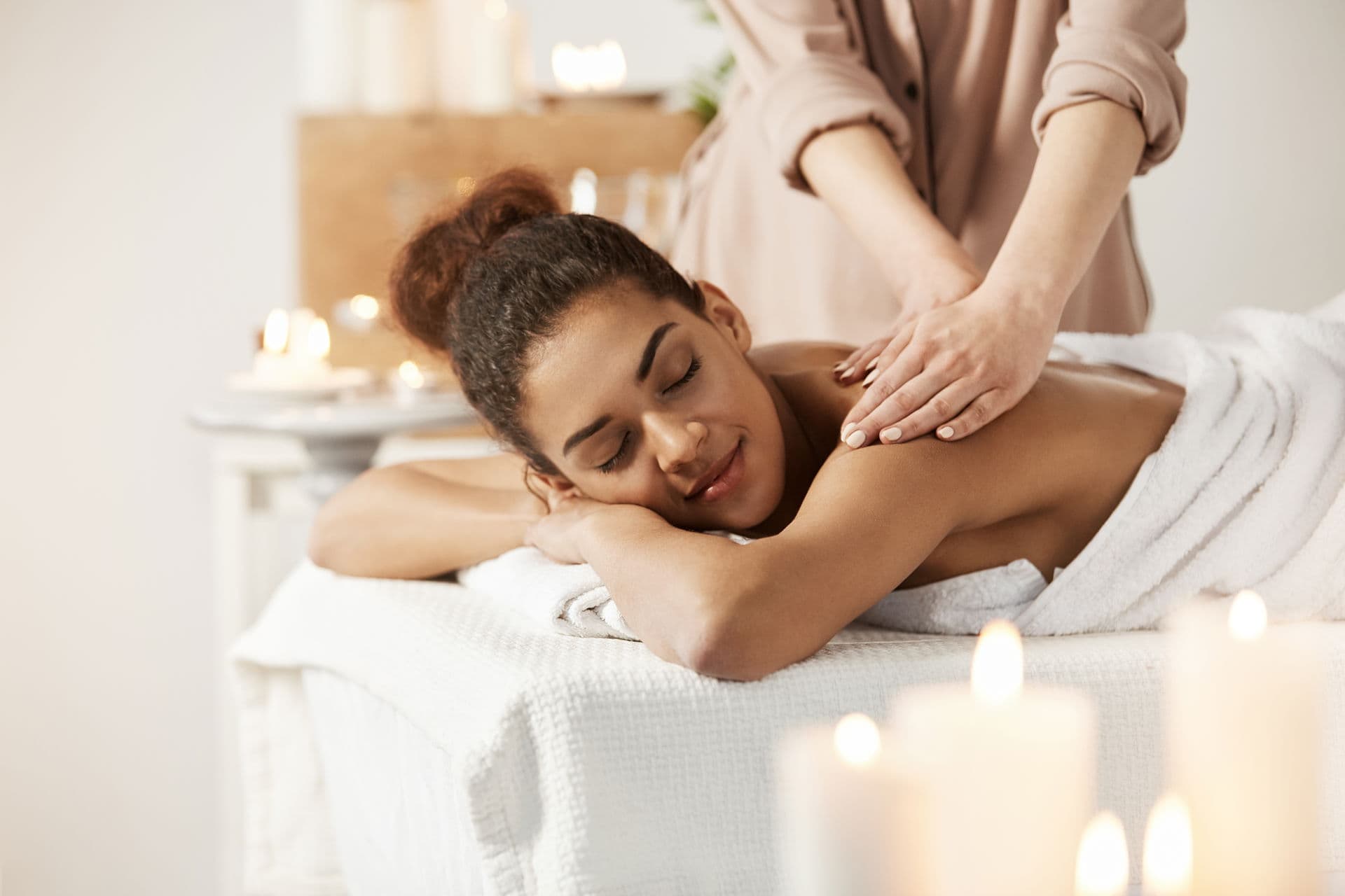
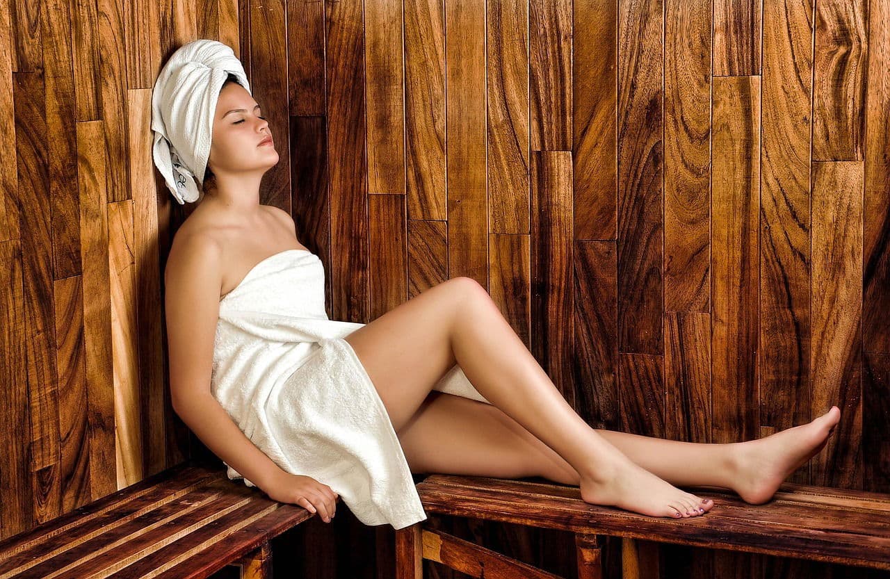
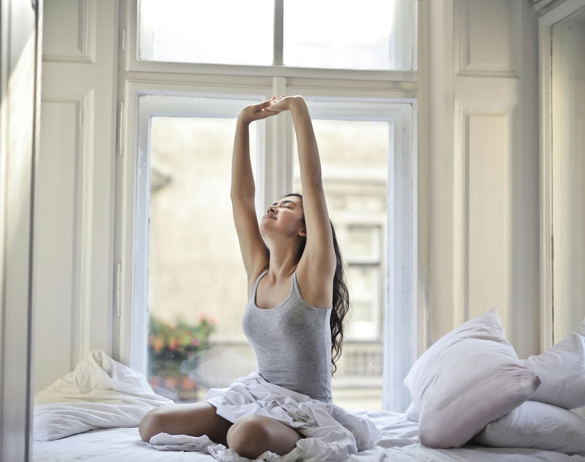
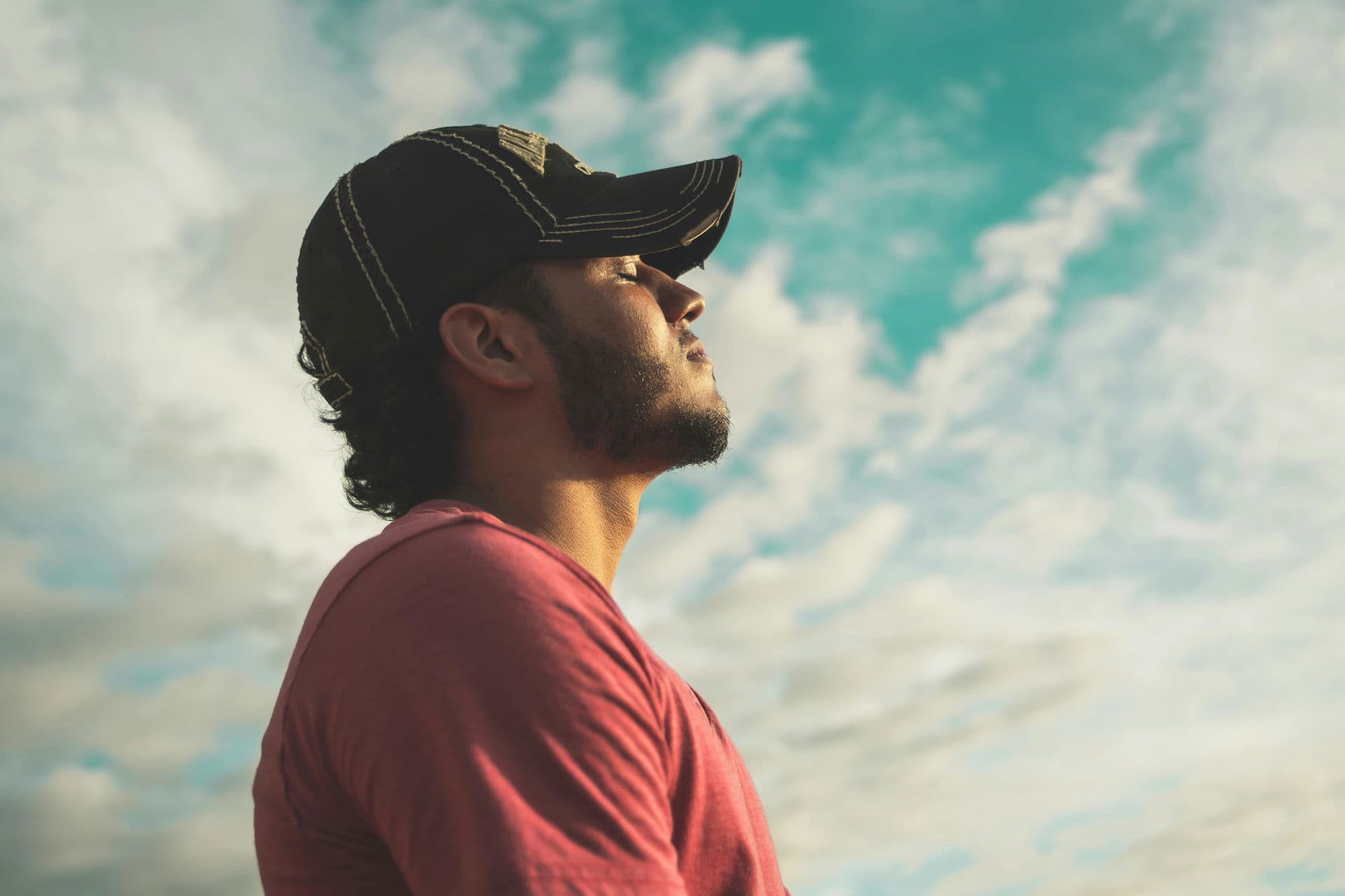
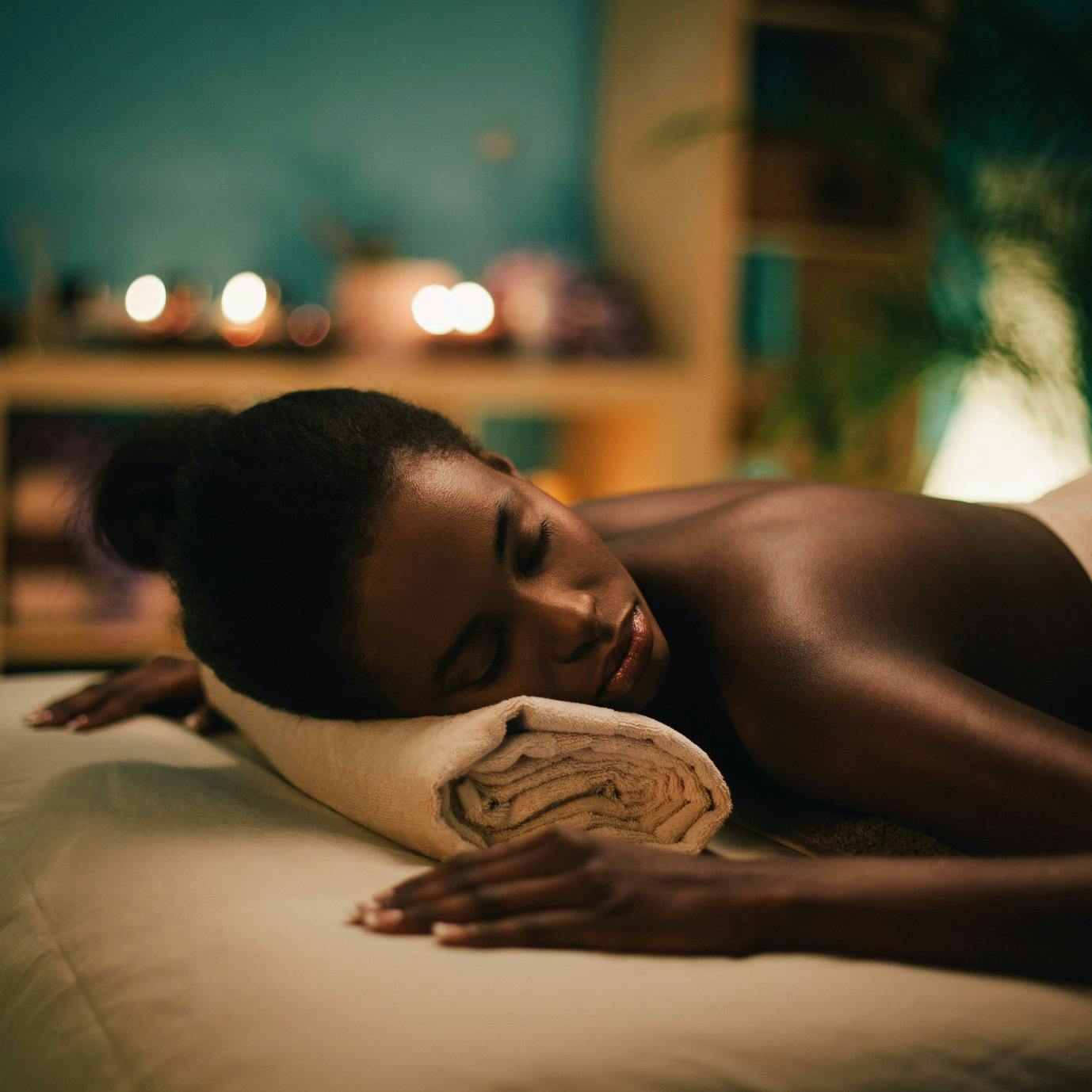
We’re thrilled to unveil our new logo and new brand aesthetic centered around how people feel when they use our product: Refreshed & rejuvenated.

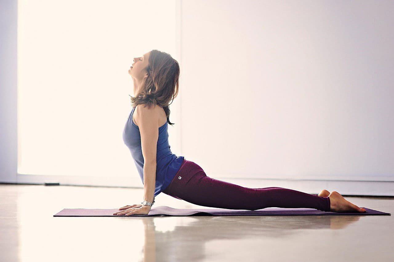
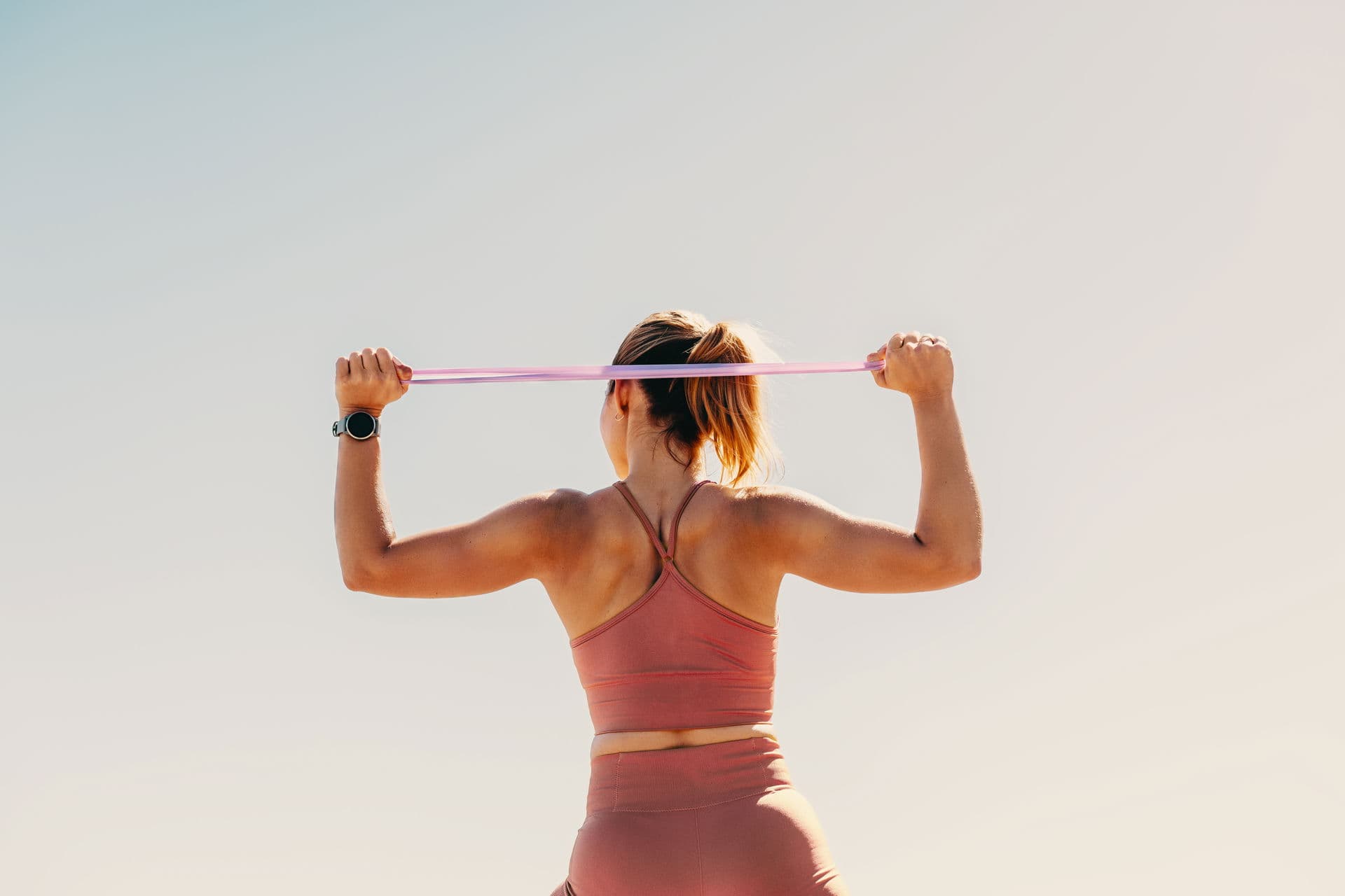
This transformation reflects our mission to empower healthier, happier living and highlights what everyone will feel when they experience Aescape.

“"This is a fresh take on our brand that embodies our mission to help you feel your best through restorative body care. We’re thrilled to share it with the world as we move towards an exciting future.”
”
The story behind our new logo is rooted in the concept of refreshment and rejuvenation. We started this redesign by evaluating our story and asking ourselves what we stand for and how we make people feel. Our distinct symbol serves as a representation not only of the elements of what we’re building, but the feeling that experiencing Aescape leaves you with.
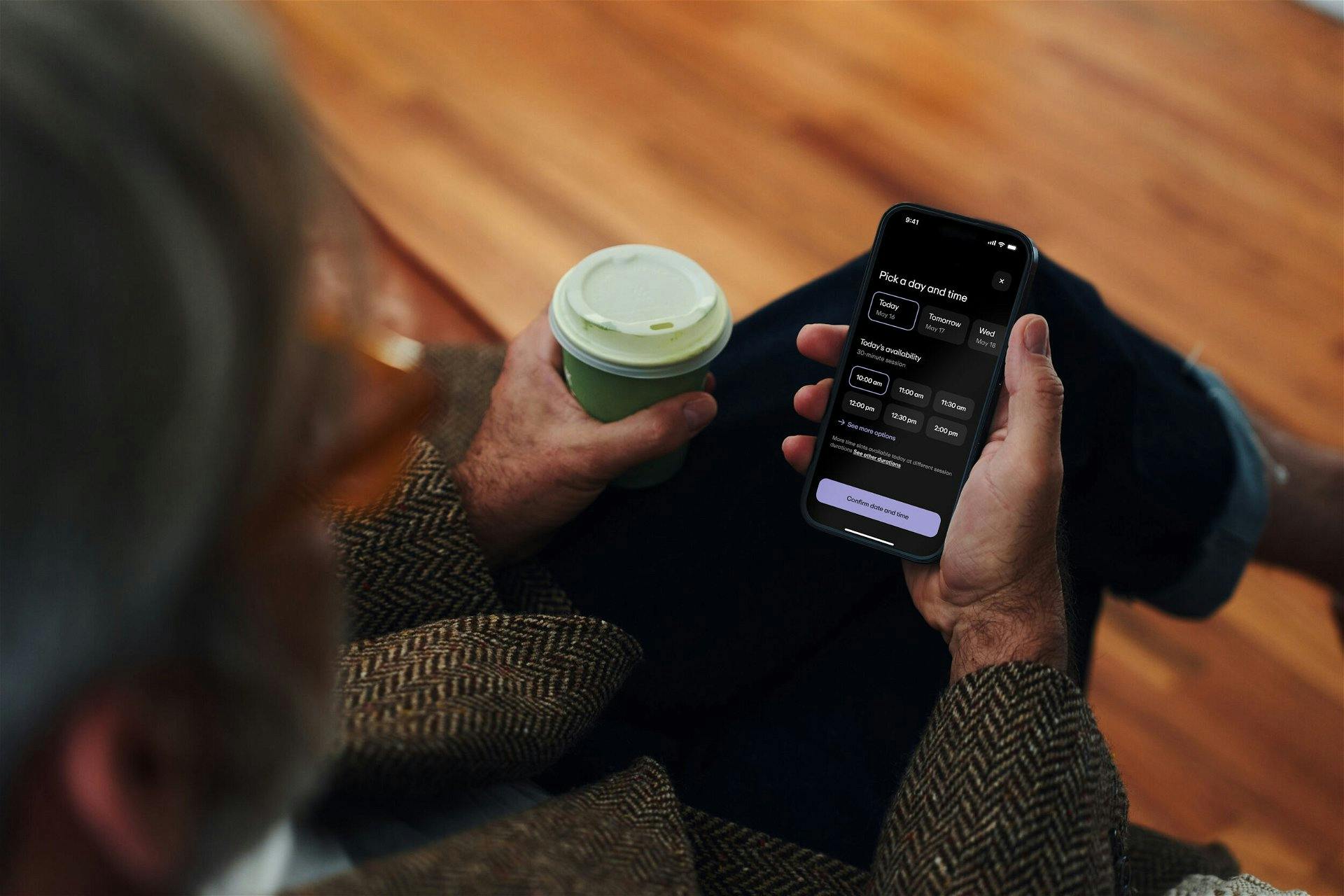
We’ve carefully curated colors in this same focus. Drawing on inspiration from nature, we’ve selected colors that are vibrant, elegant, inclusive, and evoke an overall sense of renewal. Our hero color, a soft yet strong lavender, encompasses all of these characteristics in a distinct way.

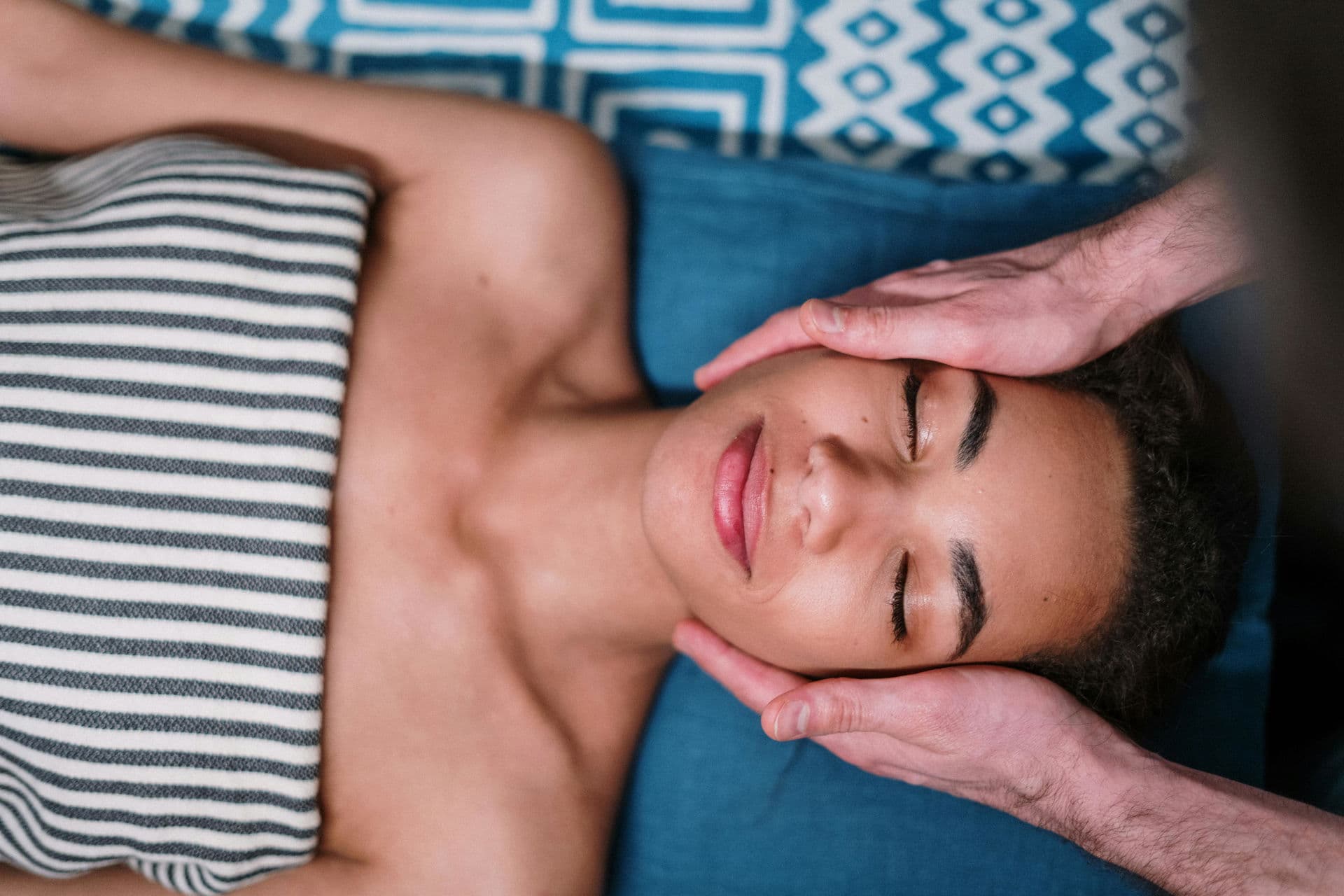
We are proud to have our new brand identity embody the spirit that Aescape aims to provide. As we move forward, we remain dedicated to empowering healthier, happier living and providing innovative massage therapy solutions that enable people to refresh and rejuvenate their bodies and minds - this brand refresh is just the start.